Shadowing the Gene Pool

Portraits, Self-Portraits, Cindy Sherman & Aging (Part 2)

My last post was inspired by a recent New York Times article about Cindy Sherman's  latest body of work. In it, she presents herself in the style of old Hollywood screen goddesses who are past their prime. Rather than looking sadly like they are trying to still look like their younger selves, the women that Sherman portrays have a certain dignity to them. They look like they are older. They look like they have lived a life. Photograph by Cindy Sherman
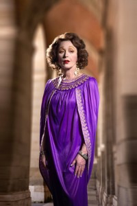
Sherman states that this work, which came after a 5-year hiatus, was the result of she herself getting older and trying to come to terms with it. She says, “I, as an older woman, am struggling with the idea of being an older woman.” And apparently she is using this new series to try to figure it out.

Sherman is now 62, an age which for many is an in-between state — not quite still middle-aged, but not yet old-old. As author Gerald Marzaroti recently wrote of people that age: "You are milling in the anteroom of the aged." The fact that Sherman is professing that this series of pictures is more autobiographically based than her prior work is really interesting to me, as is the fact that her age is a driving force in making it.

Numerous photographers have used aging as a foundation for their work- Anne Noggle  and Lucy Hilmer are two who leap immediately to mind—and I, too, find myself very consciously exploring it in my own work at the moment.

I have always been interested in the process and effects of aging. For the “Shadowing the Gene Pool” series, I photographed young children and very old adults, marveling in their similarities and differences. I did the same in the “Birth & Death” series. In my current work, I am looking at my own body, how I am aging, what I think about it, and how I see myself as I age, in addition to looking at how others age. While it is not the only issue that my new work tackles, it is a big part of it.

New York Times columnist David Brooks wrote a column back in March that speaks to how being older can enrich one’s work. Here is an excerpt:

“…(People are) less likely by middle age to be blinded by ego, more likely to know what it is they actually desire, more likely to get out of their own way, and maybe a little less likely…to care about what other people think.

…They achieve a kind of tranquility, not because they’ve decided to do nothing, but because they’ve achieved focus and purity of will. They have enough self-confidence, and impatience, to say no to some things so they can say yes to others.

From this perspective, middle age is kind of inspiring. Many of life’s possibilities are now closed, but limitation is often liberating. The remaining possibilities can be seized more bravely, and lived more deeply.”
Rectangle vs. Square Format

Because I have been wrestling with what kind of camera to use for my current project, I have also been confronted with the issue of the square vs. the rectangular format. This is not a new phenomenon for me. Back when I was in grad school, I had a lot of trouble trying to find my voice as an artist. At the time, I used 35mm, 6x7, and 4x5 cameras, but never was comfortable with any of them. It wasn't until my father gave me an old panoramic camera that had belonged to my great-grandfather that I began understanding that format can make a huge difference in the kind of work you do. This camera, an Al-Vista Model 5D, took 5" roll film and took a picture with roughly 160˚ angle of view. (I used this camera with cut-down 11" x 14" sheet film exclusively for the Shadowing the Gene Pool series.) From the start, I discovered that the long, slender panoramic format gave me a creative voice that had been missing. There was something about how I could arrange things in space that completely spoke to me, and since that time I have used a variety of panoramic cameras and loved them all. The fact that panoramic images are rectangular isn't lost on me, but I don't seem to be limited by them creatively in the same way that I am by less-long rectangles.

I didn't start using square format cameras until much later, but discovered when I did that they, too, allow me to work with space in a way that allows me to speak with my pictures in a way that the conventional rectangular formats (35mm, 6x7, 4x5) never have. As a beginner, I never realized the powerful impact that an image's shape and dimensions can have on the meaning of a photograph. Now that I do, I choose my tools for any given project with great care.

Same Object - Different Uses

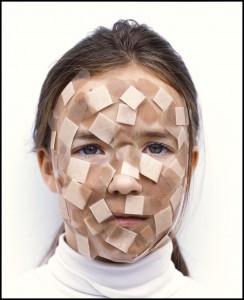
If you give each of 5 different artists the exact same object to use in her/his work, you are guaranteed to get 5 different results. I've always been interested in this idea. Take for example, band-aids. I recently saw this picture by Eric Klemm, which used a lot of band-aids: "Laura"


What I see in this picture is vulnerability, sadness, a fierce barrier that has been put up between the world and this child. The fact that the application of the band-aids was so deliberate and purposeful makes it the antithesis of playful. They work as a defense against some unseen threat, and imply impending injury of some kind to me.


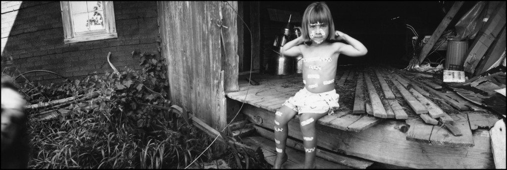
Compare the use of the band-aids in that photo to one that I took, which is from the "Shadowing the Gene Pool" series:

"Muscle Girl"

In this picture, the band-aids serve quite a different purpose. Rather than being a barrier, they are used almost like tattoos, markers of power and strength. The body English of the little girl adds to that effect. They say, "Yes, I am vulnerable, but that's irrelevant."

I'm sure if I searched the Web for "children with band-aids" I would find countless pictures which would use the band-aids to express different things. That's why no photographer should ever shy away from photographing anything. It's not WHAT you photograph, it's HOW you photograph it that will make it fresh and exciting- or not.