technical issues

The Thread in the River- Installing the Show

To say that I have been buried in the preparations for this show the past few months is to make a gross understatement. The pace has been non-stop, but it has all come together without any last-minute disasters, which is a miracle. I went down to the Alice F. and Harris K. Weston Art Gallery today to help with the layout of the work as it is installed. Since virtually none of this work has ever been exhibited before, I am beyond nervous as to the impact it will have once it is all up.
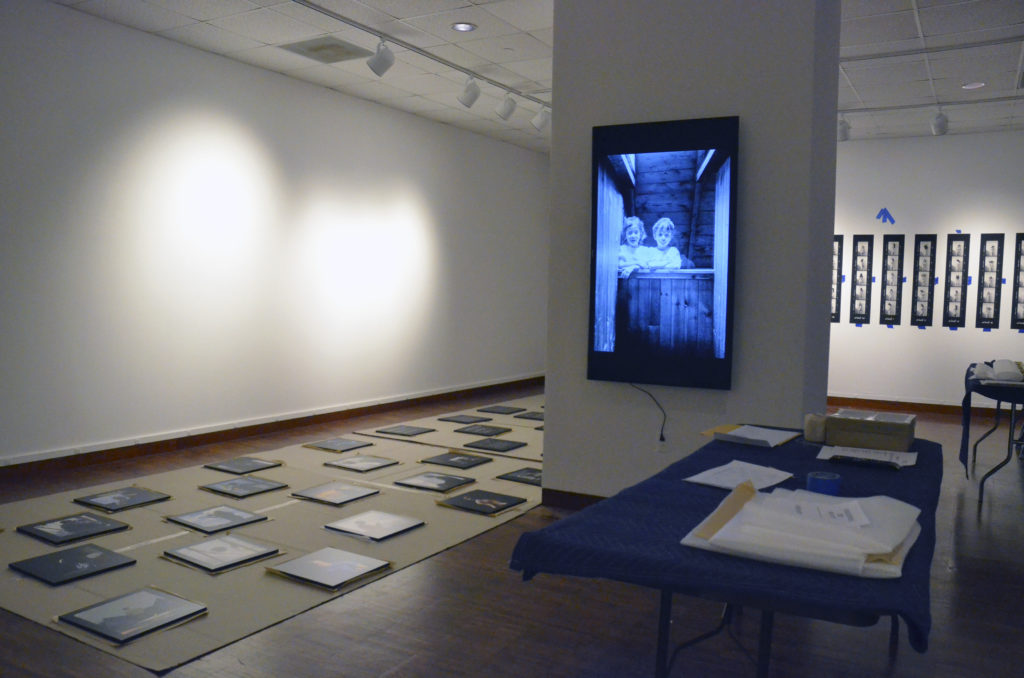
Installing "The Thread in the River" exhibition at the Weston Art Gallery, Cincinnati, OH

The show consists of 6 different bodies of work. Will all of those series make sense when seen together in the same space? Does the order and presentation of the work help the viewer make sense of it? Is it a problem that 2 of the series are in color and 4 are in black & white? Or that two series are presented as videos and 4 consist of still images? Does anything need rethinking for future exhibitions? What's missing that could make it stronger?
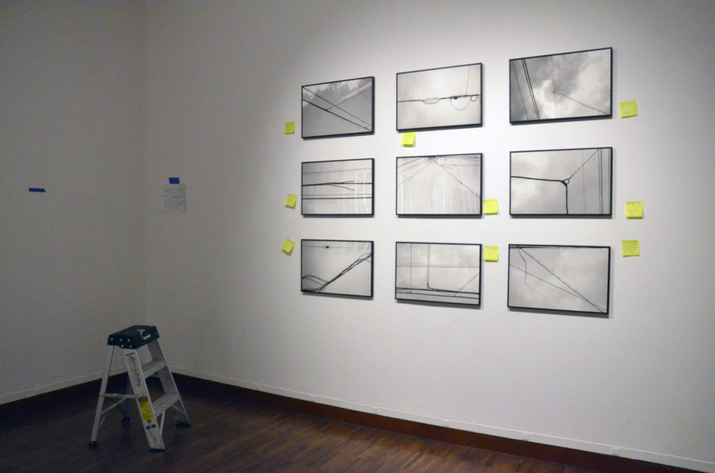
Initial installation of "The Wind Telephone" series at the Weston Art Gallery, Cincinnati, OH

Only about half of the work was up today, and none of the labels were done, so it was hard for me to answer those questions. I'm going back tomorrow to look things over again, and might get a better sense of it then.
Piezography Workshop for Black & White Printing

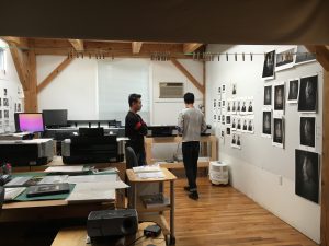
My current project, titled The Thread in the River, is a mix of photographic media: film, digital, and video. I am creating a number of series, some of which are going to be printed in black and white. My Tears of Stone: World War I Remembered project was printed with  Piezography software and inks back in the early '00's, so I knew that that is the method that I want to print this new b&w work with. But a lot has changed since then and I knew that I needed a total reboot. So I signed up for one of the New Piezography Workshops at Cone Editions Press in East Topsham, Vermont, and traveled there last month for it. With participants from China, Japan, Canada and the US, it was a truly international experience. Throughout the workshop, Jon ConeWalker Blackwell, and Dana Hillesland each filled us in on different aspects of the process, including information about how to prepare image files, how the software works, printer setup and maintenance, and far, far more. We were able to print on a large assortment of papers using 5 different inksets. They did a lot of one-on-one work with each of us, as we all had come there with different needs and agendas.IMG_3408

In addition, I got to see Cathy Cone's photographic work, which is gorgeous and evocative. At the end of the last day, we spent some time at the waterfall nearby, then walked back to share wine, beer, and stories. It was a beautiful summer day and a fitting end to a fantastic experience, surrounded by people for whom craft is important. For anyone who is serious about fine digital black & white printing, Piezography is the way to go.

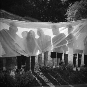
Photograph by Cathy Cone

Dayton Art Institute Artist's Talk

Tomorrow (Thur., Sept. 17) I'll be giving an artist's talk about the "Tears of Stone" show currently on exhibit at the Dayton Art Institute. The show is up through Sunday, October 4. Here's a link with more information about the lecture, which includes a short video of me talking about one of the pieces in the show.

I've spent the past few days putting this talk together. In brief, it will include information about the research I did for the project, the technical aspects and challenges of shooting it, and I'll be reading excerpts from my field notebooks about experiences I had while working on the project. I'm really thankful for the opportunity to do this- it's been a while since I've made a presentation about this work, and it's nice to get back to it.

Creativity & Being Uncomfortable

My most recent posts have touched on some of the technical issues that I've been having with my current project. The question of what camera to use has loomed large, and has gotten me thinking a lot about comfort zones. The questions I have wrestled with are: "Am I too comfortable using the panoramic and/or square format? Would I challenge myself more by using a different format camera?" The answer I have come up with, at least for now, is, "No" to both questions. One of things I love about using the panoramic or square format is that I constantly feel challenged to further explore their possibilities. Rather than feeling predictable, they force me to rethink what I am doing every time I use them. I have never felt that way using 35mm, 6x7 or 4x5 cameras.

But the larger question here is: "Will my work improve if I force myself to work in a way that makes me feel uncomfortable?" My answer to this is: "Yes." I also believe, however, that if I am uncomfortable with everything I am doing, my brain grinds to a halt. What works best for me is to make myself uncomfortable in limited-but-ever-changing ways throughout the course of a project. I've found that throwing only one or two wrenches into the works at any given time does an amazing job at putting me off my stride and forcing me to reconsider what I am doing.

Being uncomfortable is part of the sometimes-painful process of bringing new work to life, because it leads to uncertainty. But I've found that I ultimately grow more creatively when I force uncomfortableness upon myself and that makes that it totally worthwhile. Here's a great article that speaks to this: "The Creative Benefits of Exploring the Uncomfortable".

Rectangle vs. Square Format

Because I have been wrestling with what kind of camera to use for my current project, I have also been confronted with the issue of the square vs. the rectangular format. This is not a new phenomenon for me. Back when I was in grad school, I had a lot of trouble trying to find my voice as an artist. At the time, I used 35mm, 6x7, and 4x5 cameras, but never was comfortable with any of them. It wasn't until my father gave me an old panoramic camera that had belonged to my great-grandfather that I began understanding that format can make a huge difference in the kind of work you do. This camera, an Al-Vista Model 5D, took 5" roll film and took a picture with roughly 160˚ angle of view. (I used this camera with cut-down 11" x 14" sheet film exclusively for the Shadowing the Gene Pool series.) From the start, I discovered that the long, slender panoramic format gave me a creative voice that had been missing. There was something about how I could arrange things in space that completely spoke to me, and since that time I have used a variety of panoramic cameras and loved them all. The fact that panoramic images are rectangular isn't lost on me, but I don't seem to be limited by them creatively in the same way that I am by less-long rectangles.

I didn't start using square format cameras until much later, but discovered when I did that they, too, allow me to work with space in a way that allows me to speak with my pictures in a way that the conventional rectangular formats (35mm, 6x7, 4x5) never have. As a beginner, I never realized the powerful impact that an image's shape and dimensions can have on the meaning of a photograph. Now that I do, I choose my tools for any given project with great care.

Thoughts on Film and Digital

As I've been working on my current project, I've been thinking a lot about the tools I'm using and the results I have been getting from them. In brief, I have not been happy. I've been using a 35mm DSLR camera and LOVE getting the instant feedback that only a digital camera can give me. Plus, they are high resolution, the color is great, but.... most of the images just don't cut it. Why? Because all photographic equipment and media has a unique "footprint". This footprint is created by a number of factors, including, but not limited to the camera format, the lens used, the aperture used, and whether the camera is uses digital or film for recording the image. In my experience, images shot on film look different than ones shot digitally. I am not talking about resolution or sharpness or even color/grayscale quality here. I am talking about things like the richness and spatial depth that a film image inevitably seems to have that digital doesn't. (At least the images that I take reflect this!)

Don't get me wrong- I would "mortgage a kidney" (as one fellow photographer put it) for a medium format digital camera with a square sensor that rendered an image like my film cameras do. But that camera doesn't exist right now. I realize that I am placing myself in the middle of the film vs. digital debate here, and that many readers will completely disagree with me. But I have no time for that debate- for me it's not an issue of whether film or digital is better. The issue is: What equipment will yield the kind of visual results I want? For now, the answer for me is to use a medium format film camera and scan the resulting negative so that I can print it digitally.