photographers

Memorable Quotes- Jerry Uelsmann & Duane Michals

There are a many thoughtful photographers out there who speak eloquently about their work and photography in general, but few are as inspiring as Jerry Uelsmann and Duane Michals. (I could list more, like Kip Fulbeck, for instance, but will limit myself for now.) Last month I attended the Society for Photographic Education's national conference, where 82-year old Uelsmann was a featured speaker. Here are a few of the more memorable things he said:

"I asked an historian, "What IS history?", and he answered, "History amounts to those things that you choose to remember."

"The camera is a license to explore."

"The viewer always completes the image."

"Art is one of those areas where there is more than one right answer."

"Once you think you know everything, the questioning stops."

And perhaps my favorite: "I don't want this presentation to be a snore-fest with yawn-sauce on the side."

Michals, who is now 85, was equally entertaining and challenging when I heard him speak at the Cincinnati Art Museum in 2000. Here are some of his most memorable lines:

"Do not try to be perfect, please. Perfect is boring. Your humanity lies in your vulnerability."

"Pay attention to your mind. You put crap in your mind, you get crap in your life. You put good things in your mind, you get good things in your life."

"I think about thinking."

"Don't come crying to me because nothing happened. Nothing happened because you didn't make it happen."

"You have 2 choices in life: doing and bullshit. Don't tell me what you are going to do. Show me what you have done."

"Guess when you were born? You were born now."

When golfer Arnold Palmer died in 2016, it was written of him, "People loved him because, in a world of sullen superstars, Palmer radiated joy and delight in the treasures of his life... He had a wonderful time being Arnold Palmer and squeezed every drop of juice from the experience." The same can be said about Uelsmann and Michals, both giants of 20th century photography.

Piezography Workshop for Black & White Printing

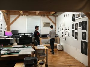
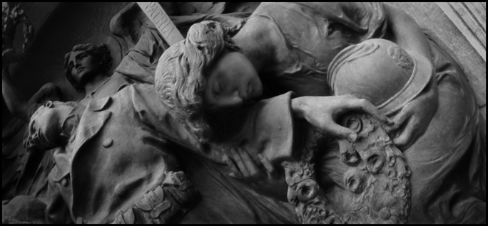
My current project, titled The Thread in the River, is a mix of photographic media: film, digital, and video. I am creating a number of series, some of which are going to be printed in black and white. My Tears of Stone: World War I Remembered project was printed with  Piezography software and inks back in the early '00's, so I knew that that is the method that I want to print this new b&w work with. But a lot has changed since then and I knew that I needed a total reboot. So I signed up for one of the New Piezography Workshops at Cone Editions Press in East Topsham, Vermont, and traveled there last month for it. With participants from China, Japan, Canada and the US, it was a truly international experience. Throughout the workshop, Jon ConeWalker Blackwell, and Dana Hillesland each filled us in on different aspects of the process, including information about how to prepare image files, how the software works, printer setup and maintenance, and far, far more. We were able to print on a large assortment of papers using 5 different inksets. They did a lot of one-on-one work with each of us, as we all had come there with different needs and agendas.IMG_3408

In addition, I got to see Cathy Cone's photographic work, which is gorgeous and evocative. At the end of the last day, we spent some time at the waterfall nearby, then walked back to share wine, beer, and stories. It was a beautiful summer day and a fitting end to a fantastic experience, surrounded by people for whom craft is important. For anyone who is serious about fine digital black & white printing, Piezography is the way to go.

Photograph by Cathy Cone

Portraits, Self-Portraits, Cindy Sherman & Aging (Part 2)

My last post was inspired by a recent New York Times article about Cindy Sherman's  latest body of work. In it, she presents herself in the style of old Hollywood screen goddesses who are past their prime. Rather than looking sadly like they are trying to still look like their younger selves, the women that Sherman portrays have a certain dignity to them. They look like they are older. They look like they have lived a life. Photograph by Cindy Sherman

Sherman states that this work, which came after a 5-year hiatus, was the result of she herself getting older and trying to come to terms with it. She says, “I, as an older woman, am struggling with the idea of being an older woman.” And apparently she is using this new series to try to figure it out.

Sherman is now 62, an age which for many is an in-between state — not quite still middle-aged, but not yet old-old. As author Gerald Marzaroti recently wrote of people that age: "You are milling in the anteroom of the aged." The fact that Sherman is professing that this series of pictures is more autobiographically based than her prior work is really interesting to me, as is the fact that her age is a driving force in making it.

Numerous photographers have used aging as a foundation for their work- Anne Noggle  and Lucy Hilmer are two who leap immediately to mind—and I, too, find myself very consciously exploring it in my own work at the moment.

I have always been interested in the process and effects of aging. For the “Shadowing the Gene Pool” series, I photographed young children and very old adults, marveling in their similarities and differences. I did the same in the “Birth & Death” series. In my current work, I am looking at my own body, how I am aging, what I think about it, and how I see myself as I age, in addition to looking at how others age. While it is not the only issue that my new work tackles, it is a big part of it.

New York Times columnist David Brooks wrote a column back in March that speaks to how being older can enrich one’s work. Here is an excerpt:

“…(People are) less likely by middle age to be blinded by ego, more likely to know what it is they actually desire, more likely to get out of their own way, and maybe a little less likely…to care about what other people think.

…They achieve a kind of tranquility, not because they’ve decided to do nothing, but because they’ve achieved focus and purity of will. They have enough self-confidence, and impatience, to say no to some things so they can say yes to others.

From this perspective, middle age is kind of inspiring. Many of life’s possibilities are now closed, but limitation is often liberating. The remaining possibilities can be seized more bravely, and lived more deeply.”

Portraits, Self-Portraits, Cindy Sherman & Aging (Part 1)

The New York Times recently  published an article on photographer Cindy Sherman that focused on her most recent work, which is being exhibited for the first time in New York City this month. Throughout her 40-year career, Sherman has made photographs using herself as a model. At the time that her "Film Stills" series was catapulting her to fame, she stated that these portraits were not “about” her. By this she meant that they did not contain any autobiographical content, and that the viewer should not expect to understand anything about her as a private individual by looking at the pictures. Up to now, she has always maintained that stance about all of her work.

But the New York Times article raised my eyebrows when I read the lines, "...she is now willing to see aspects of herself even in her early photos."

This shift is significant, and I’m sure will lead to much discussion among critics, art historians, and students of her work. Sherman herself attributes this change in her own assessment of her past work to the fact that she is now older (62, to be specific) and looks back at that work from a different perspective than she had when she was younger.

This makes sense to me. As we age, there is often a natural evolution in how we see ourselves. We look back at our own history and ask ourselves, “How could I have been so naïve/courageous/stupid/bold? Why did I do that? Why didn’t I do that? What was I thinking?!” and myriad other questions.

In the case of art, one of the most valuable actions I have taken in recent years has been to look back through my archives every once in a while and try to understand my older work in a new way. With the passage of time, new life experiences help me to understand my younger creative self better, and in different ways that were invisible to me before. I’m glad that I have kept a lot of my early work so I can study it in this way.

I would encourage any artist to do so. If you don’t have the space to keep a lot of original artwork, then keep what is most important/significant to you and digitize as much of the rest of it as you can. Looking at digital reproductions of your artwork is not even close to being the same as looking at the originals, but it is the next best thing, and certainly better than nothing. In this way, you can haul out as much or as little of your past creative history as you want, whenever you want, and learn from yourself about yourself.

The older you get and the more you have to look back on, the more threads you will find that connect the various bodies of work that you have done and the better you will understand your creative voice as it has evolved.

"The Dust Lady" Photograph

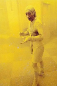
Of the hundreds of thousands of photographs that were made in New York City on September 11, 2001, many of them resonated with people for different reasons. The images of the aircraft hitting the Twin Towers, the towers burning, of humans falling from them, and of their ultimate collapse all caused horrified reactions from those who saw them. But there was one picture taken that day which resonated on a profoundly human level, that reduced the event to the intensely personal, and that somehow reflected the shock and paralysis that so many felt at the time. That picture, later titled "The Dust Lady", was taken by a photographer from the Agence France-Presse, Stan Honda, and it was of a woman named Marcy Borders, who worked at that time as a legal assistant at the Bank of America.

dust ladyAs film director Errol Morris wrote about documentary filmmakers Albert and David Maysles, "The role of documentary film is not to give us reality on a plate. We have plenty of our own reality to deal with. It should make us think about reality." The photograph of Marcy Borders that was taken on 9/11 certainly did that, and more.

Ms. Borders died in mid-2015 and the New York Times Magazine ran a memorial article on her that is well worth reading. Although she became an iconic figure for many because of The Dust Lady photograph, the New York Times article reminds us that every person in every photograph has a story that no photograph can ever tell.

We are all more than what we look like or what we show of ourselves in photographs.


Artists I Like- Lars Tunbjork

The poet Philip Levine (1928-2015) once said, "I think poetry will save nothing from oblivion, but I keep writing about the ordinary because for me it's the home of the extraordinary, the only home." That sentiment perfectly applies to the work of Swedish photographer Lars Tunbjork (1956- 2015). Tunbjork specialized in photographing the ordinary, the everyday, the mundane. His brilliance lay in his photographing those scenes in ways that made us reconsider them and see them in new, fresh ways.

Here is his take on the modern office:

images


And his observations on people in a variety of settings: Lars-Tunbjörk-5


Dayton Art Institute Artist's Talk

Tomorrow (Thur., Sept. 17) I'll be giving an artist's talk about the "Tears of Stone" show currently on exhibit at the Dayton Art Institute. The show is up through Sunday, October 4. Here's a link with more information about the lecture, which includes a short video of me talking about one of the pieces in the show.

I've spent the past few days putting this talk together. In brief, it will include information about the research I did for the project, the technical aspects and challenges of shooting it, and I'll be reading excerpts from my field notebooks about experiences I had while working on the project. I'm really thankful for the opportunity to do this- it's been a while since I've made a presentation about this work, and it's nice to get back to it.

Thoughts on Influences

I saw a show a few months ago that made me angry. When I realized that I was angry, I stopped to ask myself why. The subject matter of the photographs was landscapes, the pictures were impeccably printed and presented cleanly. Straight photography at its best. At first glance, it seemed absurd that I would get angry about work like this. But then it dawned on me that this particular work belonged to a long and powerful photographic tradition of Modernism  that still resonates today. When I first became involved with photography in the 1980's, this approach to the medium was everywhere. It was the kind of photography that got the most accolades and attention from the mainstream media and the public. It was what was (mostly) taught in schools. At the same time, the Postmodern approach to photography was extremely popular in galleries and museums, and that was mostly what art critics were championing.

I didn't feel at home in either camp. The issues that Postmodernism examined were not the kinds of things that I was interested in. But neither was I comfortable with the kind of approach that had made the Modernists so successful in the early to mid 20th century, particularly as it related to subject matter. I found both approaches, with a few exceptions, to be relatively dry spiritually and emotionally. They held no magic for me, and didn't speak to me in a way that I could respond to.

Seeing the exhibit of landscape photographs mentioned above generated anger because it made me realize just how powerful an influence the Modernist male photographers in particular had on me at that time. The show represented everything I don't want to be as an artist. Seeing this work made me realize that I have been constantly fighting off the voices that were most dominant during my photographic coming-of-age. A lot of my creative struggles have sought to inject passion, emotion and narrative into my subject matter, to make photographs that speak to people personally, to make them relatable.

The takeaway? Influences can not only be positive, they can also be negative.

But the fact that they can be negative is not necessarily a bad thing. In my case, it has forced me to define for myself exactly what I want my creative voice to be. I recognize that parts of my process are more Modernist than not, but feel that the content of most of my work departs in large part from that mold.

Pinhole Photography Exhibition in Santa Fe, NM

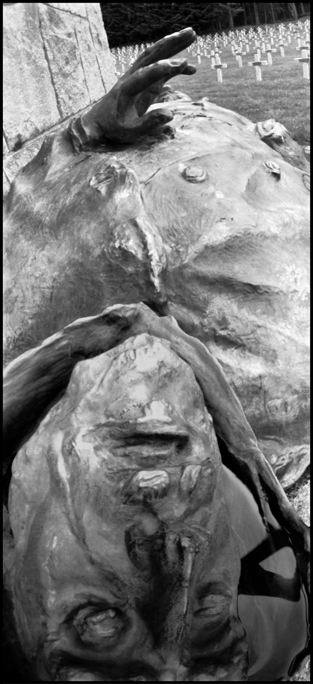
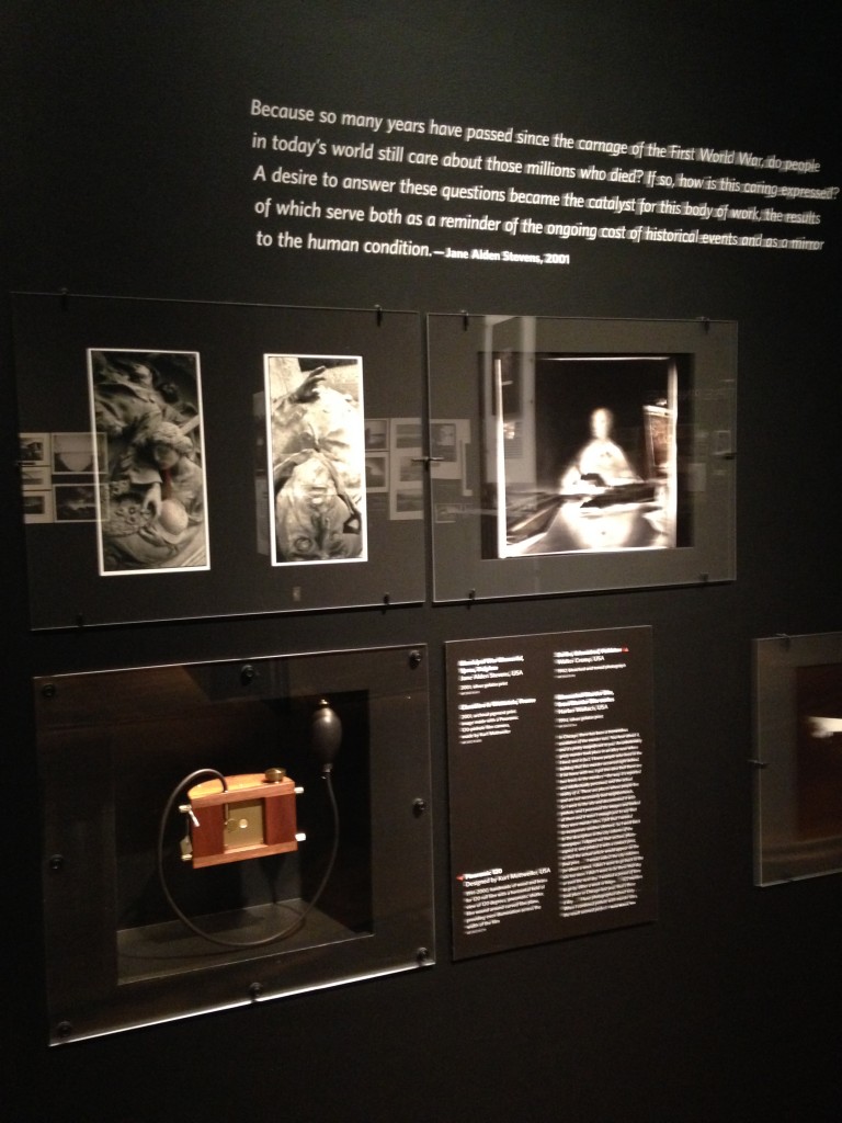
For decades, Eric Renner and Nancy Spencer have not only run The Pinhole Resource, they have also collected thousands of pinhole photographs and pinhole cameras from around the world. The Pinhole Resource Collection was recently accessioned to the Palace of the Governor's Photo Archives at the New Mexico History Museum in Santa Fe, and it is on exhibit at the museum until March, 2015. Two of my photographs (see below) are included in the "Poetics of Light" exhibition, which I was fortunate enough to see earlier in the year.

Municipal War Memorial, Ypres, Belgium

Le Wettstein French Military Cemetery, France

Although I am well-aware of the wide-range of technical and aesthetic approaches to pinhole photography, I was completely blown away by this exhibit. It is educational, enlightening, and awe-inspiring. Beautifully presented, the 40 cameras and 225 photographs made me want to go out and use my pinhole cameras immediately, even though I didn't have one with me. Interestingly, the show had the same effect on the three non-photographers I was with. We were all amazed at the range of possibilities this type of camera has.

I don't know if this show will travel, but I hope it does. Anyone who is interested in photography, analog or digital, should have a chance to see it. Here is a brief article about it in the New Yorker magazine, which includes some of the images and cameras in the exhibit.

Below is a (somewhat blurry) picture of the section of the installation that my work is in, which gives you an idea of what the exhibition itself actually looked like. (The camera displayed below my images is the same make and model that I used for shooting the "Tears of Stone" project.)

If you find yourself in Santa Fe anytime between now and the end of March, check it out. It doesn't matter if you are a (pinhole) photographer or not- it's worth it, regardless!

IMG_1039

Interview Published in AEQAI

ÆQAI (pronounced ‘I’ as in ‘bite ‘ and ‘qai ‘ as in ‘sKY’ ) is a Cincinnati based e-journal for critical thinking, review and reflective prose on contemporary visual art. An interview titled "Jane Alden Stevens: Photography in Motion" authored by Laura A. Hobson was recently published in the November, 2014, edition of AEQAI. The article includes images from various bodies of work, a discussion about my teaching career, and covers a number of issues including the role that feminism played in my classroom, mentors, technical changes in the field and my approach to art-making.

Many thanks to editor Daniel Brown for including me in this issue!

Artists I Like- Lucas Foglia

In his series "A Natural Order", Lucas Foglia turns his camera towards people who live off the grid as much as possible. He says about his subjects: "They do not wholly reject the modern world. Instead, they step away from it and choose the parts that they want to bring with them."LucasFoglia_NaturalOrder_184 While some images depict the interior or exterior of his subjects' dwellings, the photographs I find most compelling are those of the people themselves. The photos that I am posting here are therefore an edit of a body of work that was obviously already edited by the creator.LucasFoglia_NaturalOrder_374

Any reader of this blog knows that I find editing to be one of the most creative aspects of being a photographer. LucasFoglia_NaturalOrder_053Whether it is in-camera editing (done by deciding what to include or exclude from the frame), or post-shooting editing (including deciding which images are the "best, what order they should appear in, what kind of manipulation they should undergo in order to enhance what's already going on in them, etc.), I really like that part of the process. LucasFoglia_NaturalOrder_443It demands critical thinking, problem-solving, looking very closely at everything.

I think that Luca Foglia does an excellent job at both in-camera and post-shooting editing. His photographs are thought-provoking and powerful.

Artists I Like- Vivian Maier

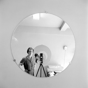
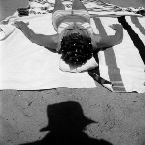
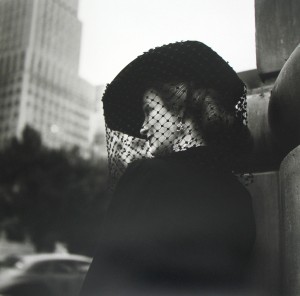
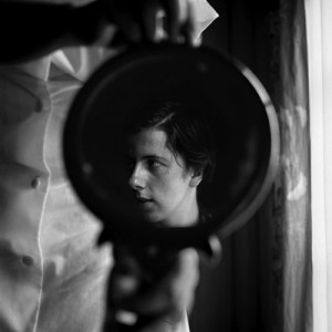
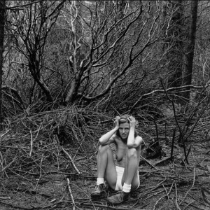
The Cincinnati Fotofocus Bienniel 2014 happened last month and I spent a considerable amount of time going to some of the exhibits that were up. Among the many that I liked, the show of Vivian Maier's work stood out for many reasons.vi finding-images-slide-OCW9-jumbo For those readers who are unfamiliar with her work, Maier was a nanny who worked primarily for families in Chicago. She was also a passionate photographer who would frequently go out into the streets with her Rolleiflex. She was a complete unknown until after she died in 2009, when her boxes of negatives were bought at auction and the images brought to the attention of others via exposure on the internet.


vivian_20Roberta Smith, in a NY Times review wrote that Maier's work "may add to the history of 20th-century street photography by summing it up with an almost encyclopedic thoroughness, veering close to just about every well-known photographer you can think of, including Weegee, Robert Frank and Richard Avedon, and then sliding off in another direction. Yet they maintain a distinctive element of calm, a clarity of composition and a gentleness characterized by a lack of sudden movement or extreme emotion."

Those sentiments sum up exactly what I was thinking when I saw this show. But I also couldn't help thinking how unique this exhibit was, in that the artist herself had no hand in it. The prints were not made by Maier, nor were they made under her supervision. The curator chose the images, the mats, and the frames, and specified in what order they would appear. It's rare that an exhibit happens under these kinds of circumstances, where the hand of the artist appears solely at the front end of the creative process.elle-vivian-maier-street-photography-8-de (As an aside, E. J. Bellocq's Storyville Portraits series and Eugene Atget's  photographs of turn-of-the-century Paris come to mind as other examples of this relatively rare phenomenon.)

In Maier's case, I couldn't help wondering if these images would have been those that the artist herself would have chosen to show us. What would she have picked instead? What themes would she have emphasized? As it was, the show was heavy on self-portraits and photographs of wealthy women in urban settings. It was fascinating to feel that Maier was not judging these women (ala Weegee), but rather observing them and presenting them to us for our own interpretation. I also vivian-maier-selfdidn't feel that she was comparing herself to them directly, although the juxtaposition of seeing her in the self-portraits with these other women led the viewer in that direction.

The exhibit was very powerful and moving, and I spent a lot of time there thinking once again about the role that editing plays in creating meaning in artwork.


Artists I Like- Diego Goldberg

Yet another entry in the "long-term project" list: The Arrow of Time project by Argentinian photographer Diego Goldberg. Every year on June 17, Goldberg and his family members make an individual head-and-shoulders portrait of him-or-herself and place them on a timeline. 1976. Diego and Susy.

Over the years, the timeline has expanded to include the addition of spouses, children and grandchildren as they were born.

1984. Diego, Susy, Nicolas, Matias, Sebastian.

One of the most interesting aspects of this project is that the pictures are presented vertically, thus allowing the viewer to look at the face of only one person at a time through the years. At the same time that the viewer's eyes take this in, one is still completely aware of the other faces on the periphery of one's vision. It's almost as if the others are lurking, daring you to see them.

2014. Diego, Susy, Nicolas, Matias, Sebastian.

Another aspect of this work that intrigues me is the singularity of the family members. They relate to each other only because each photograph in any given year is placed adjacent to the others, not because they coexist in the same physical space the way that Nicholas Nixon's "The Brown Sisters" do. Goldberg and his family members each stare out at the viewer, giving us no sense of their connection to each other.

This project is a great example of how the presentation of photographs can create meaning, and how repetition can do the same.


Artists I Like- Nicholas Nixon

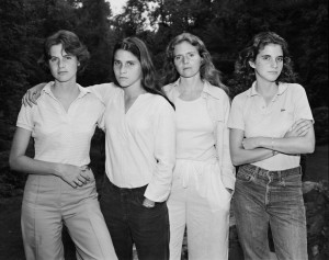
My recent posts on Lucy Hilmer's work and on long-term projects are obvious clues to what is on my mind recently, photographically speaking. It therefore feels only fitting that I write today about "The Brown Sisters" project by Nicholas Nixon, for which Nixon has taken a photograph of his wife and her three sisters once a year for the past 40 years. 1975, New Canaan, Conn.

I have been aware of Nixon's entire body of work for a long time now, and have been intrigued by "The Brown Sisters" series, specifically, as it has unfolded over the years. The New York Times recently published an article about this series, which will be published in a book in November.

2014, Wellfleet, Mass.

Seeing Nixon's pictures in the Times article and reading the accompanying text make me consider exactly what it is that I am trying to do in my own long-term projects. More specifically, they bring up a question I ask myself frequently: "How are my own long-term projects different from those of other artists?"

Are they really different? If so, in what way? What distinguishes my work from any of the other long-term portrait or self-portrait projects that are out there? It's critical for me to answer these questions, and I'm glad that I have plenty of time to think about them as I work on gathering and editing the various projects that I've been working on over the years.

Do I have answers to these questions at this time? No. Will I ever answer them? Maybe. But forcing myself to at least address them is a healthy and necessary part of my creative process.

Artists I Like- Lucy Hilmer

It's great when friends send me links to the work of artists with whom I am not familiar. Lucy Hilmer is the latest artist that I have discovered through my friend Laurie.10 Hilmer has three series on her website, all of which address the issue of time and aging. The first series, "Birthday Suits", consists of pictures that she has taken of herself every year on her birthday since 1974. In them, she wears a pair of underpants, shoes and socks, but is otherwise nude.


The second series, "The Wedding House", shows Hilmer and her husband standing in front of the house in which they got married in 1984. They go there every year on their anniversary to make take a picture commemorating the event.

The third series, "My Valentine", is a series of 21 photographs, all of which chart the first twenty-one years of her daughter's life on Valentine's Day. The pictures depict her husband, who has on a black sweater, and her daughter, who wears white, and a rose.

Because I have shot a number of series in this manner over the course of many years, I have a real appreciation for the discipline required to get out your camera and take a shot every year on the same date. Hilmer's poses hint at what is going on in her life in any given year, without giving too much away, and I really respond to that. The fact that her work is in black & white makes it relatively timeless, as does the fact that her clothing in her "Birthday Suit" series is exactly the same from year to year. This work is for anyone who has ever been interested in the relationship between photography, time and memory.


Artists I Like- David Maisel

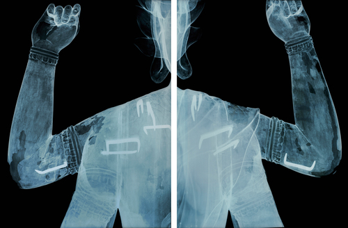
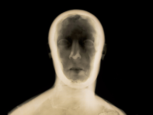
A few years ago, David Maisel created a body of work titled "History's Shadow".HS_AB8A8B_MAISELHere is what he says about it: "History’s Shadow has as its source material x-rays of art objects that date from antiquity through just prior to the invention of photography. The x-rays have been culled from museum conservation archives, re-photographed and re-worked. Through the x-ray process, the artworks of origin become de-contextualized, yet acutely alive and renewed. The series concerns the dual processes and intertwined themes of memory and excavation."

I find this body of work thought-provoking partly because of its simplicity. By specifically choosing to use x-rays of objects that pre-date the invention of photography, Maisel asks us to consider aspects of these objects that it was impossible to "know" without the photographic medium. HS_GM16_MAISELThe x-rays animate these objects in a weirdly magical way. As a viewer, I think about the vision and intent of the humans who created the objects in the first place, as well as wonder what the makers of the x-rays hoped to discover so many years later. It's a wonderful approach to memory and history- two of my favorite subjects.

Thoughts on Joan Fontcuberta

I recently attended the Society for Photographic Education's national conference in Baltimore. Joan Fontcuberta was a keynote speaker (articulate, funny, thoughtful- every keynote speaker should be so engaging!) and he said many things that really struck me. He was talking at one point about photographic truth, a topic with which he has been intensively engaged throughout his career. (Go to his website and you'll see what I mean.) He said, "In today's world, photography is Google." He went on to explain that, back when photography was born in the 19th century, everyone looked at it as the ultimate arbiter of Truth. If it was photographed, then what was seen in the photograph must be true. It did not take long for photographers to challenge this notion. And today, people treat the internet the same way. We search for information on Google and tend to believe that whatever results we find are true, even though we know that isn't so.

I found his notion really interesting, and had something to chew on for the rest of the conference.

Artists I Like- Deborah Parkin

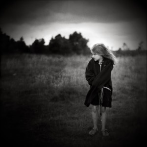
A friend of mine recently clued me in on the work of Deborah Parkin. She writes a lovely blog, in which she shares many thoughts about how her life intersects with her photography. siblings300  
She's unfailingly honest about the conflict she feels about the time spent on photography vs. the time spent with her young children. This is something all artist/parents wrestle with, I think.


I particularly like the mood in her photographs- they are very evocative. chimneys+high+res+bromoil+positive

Artists I Like- Jackie Nickerson

Jackie Nickerson has recently published a book titled "Terrain". In it, she depicts laborers on South and East African farms. f97def313f9aea1db917ccb532734ee5-large Rather than being straightforward depictions of these people at work, she shows them with the materials of their labor obstructing, at minimum, their faces, and sometimes most of their bodies.


35b38f46c2402c47df7baf0233128f86-largeThis has the effect of transforming both how we view the workers, as well as the work they do.

These photographs are great examples of how straightforward photographs can be invested with many layers of meaning.